
Introduction
The course-taking experience sits at the heart of Udemy’s product where millions of learners engage with content every day. But years of incremental updates and technical debt had made it complex, inconsistent, and hard to improve. Learners struggled to find essential tools, while engineering faced long delivery cycles for even simple changes.
As the design lead, I guided a cross-functional initiative to reimagine the experience simplifying interactions, improving discoverability, and modernising the underlying architecture. Our goal was to create a cohesive, scalable foundation for course-taking that would serve both learners and the business long term.
This case study outlines how we approached the redesign strategically, aligning teams, validating direction through research, and releasing iteratively to build confidence and impact.
Strategic Challenge
The challenge was not just to fix usability issues but to rebuild trust in the product experience itself.
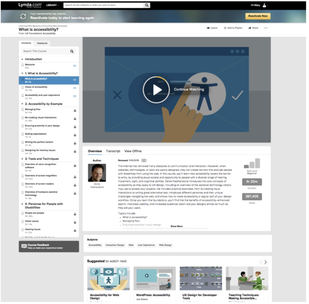
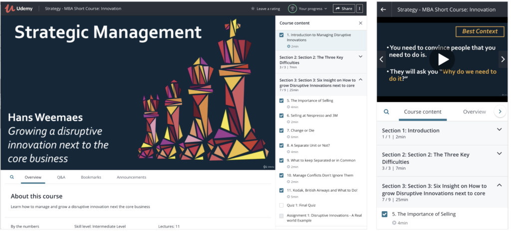
Learners reported frustration finding tools like transcripts, bookmarks, and Q&A. The interface was cluttered and unintuitive, and the technical legacy of the platform made even minor updates slow and fragile.
We needed to solve for both the user experience and the delivery process. My focus was to unify product and engineering teams around a clear design strategy, one that balanced usability improvements with a modernised front-end framework to enable faster iteration in the future.
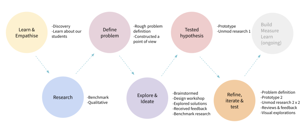
Research and Discovery
We began with a holistic assessment of the existing experience to uncover friction and opportunities for improvement. I led a series of research activities to clarify pain points and guide priorities:
- User flow audits revealed friction and redundancy in navigation.
- Usability testing confirmed learners’ difficulty in discovering in-video tools.
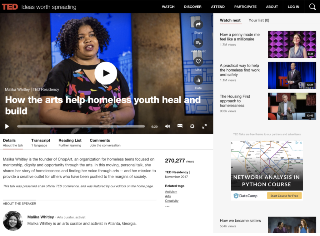
- Benchmarking against 24 learning and media platforms highlighted clear conventions for accessibility and contextual tool visibility.
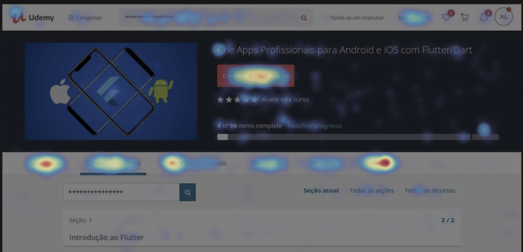
- Data analysis and heatmaps helped prioritise areas with the highest engagement drop-offs.
These findings reinforced that learners were struggling to discover the tools they needed, navigation patterns were inconsistent, key tools were hidden, and interactions lacked predictability. Our goal became to make essential learning tools visible, intuitive, and effortless to use.
Design Strategy and Collaboration
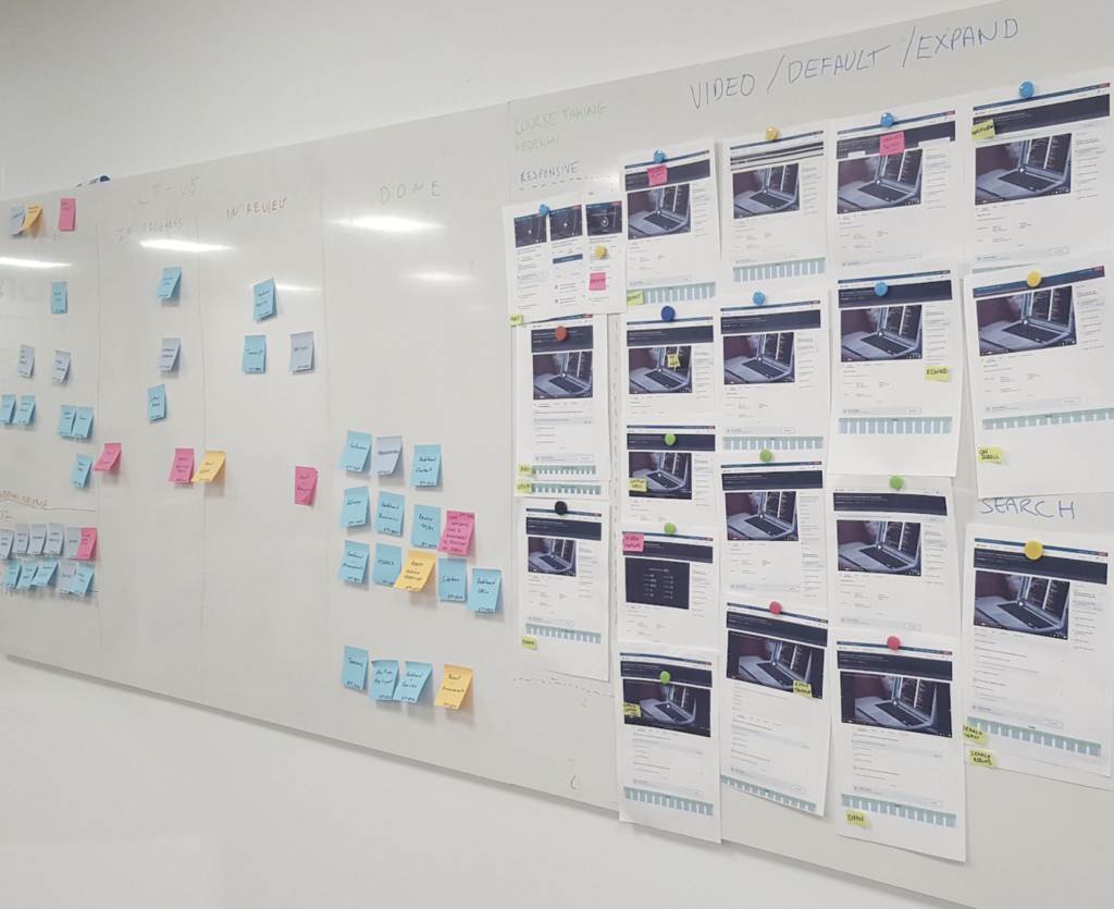
To drive alignment, I facilitated workshops bringing together design, engineering, product management, and the learning and development team.
Together we mapped the existing experience, defined the target state, and explored both UX and technical approaches. A shared insight emerged: meaningful improvement required addressing both usability and system performance.
We decided to merge the curriculum and dashboard into a single, streamlined interface, improving discoverability while laying the groundwork for a migration to React. This technical transition would reduce complexity and speed up future iteration.
Working with engineering, I defined phased milestones to de-risk the redesign allowing us to deliver incremental improvements while validating design direction along the way.
Validation and Iteration
I tested medium-fidelity prototypes with learners to validate interaction patterns and prioritise improvements. Early feedback highlighted the importance of flexibility in video layout, consistent controls across devices, and better support for mobile learners.
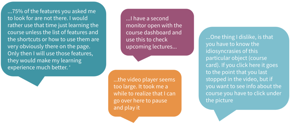
Through multiple design reviews and user testing cycles, I refined the layout, improved UI clarity, and enhanced responsiveness.
We released internally first to help surface bugs and unknowns. Given the scale of our learner base, we rolled out the new design in incremental releases, allowing us to gather metrics, monitor performance, and address feedback iteratively. This approach helped us mitigate risk and build confidence across the organisation.
Impact Summary
- Improved usability and satisfaction across Udemy’s global learner base of 30 million users.
- Achieved a 3% increase in adoption of key learning tools (bookmarks, transcripts, Q&A) within the first three months.
- NPS and satisfaction scores increased steadily post-launch, reflecting improved learner confidence and engagement.
- The React migration reduced delivery time for updates by over 40%, enabling faster iteration and experimentation.
Learnings and Reflections
The redesign reinforced the importance of approaching UX improvement as both a design and systems challenge. Collaboration across disciplines was critical combining design facilitation with technical alignment allowed us to deliver lasting value.
I also learned the importance of contingency and adaptability. Midway through the project, a company reorganisation shifted resources away from learning, impacting post-launch tracking. Despite that, the groundwork we established clear goals, strong documentation, and cross-functional clarity ensured the work continued to deliver value long after the immediate release.
For me as a design leader, this initiative was an early lesson in how strategic clarity, structured iteration, and consistent communication can transform even a constrained, legacy experience into a confident, modern product foundation.